We recently wrapped some fun identity and packaging concept work for a new, high-end household cleaning brand. Starting with the name, Aura, the team explored a variety of approaches to create a distinctive, premium look and feel for the line that would stand out on shelf and pay off on our positioning for the brand as “The Essence of Clean.” We covered a lot of ground, and greatly expanded our pattern library, in our pursuit of premium, but ultimately narrowed the field to three very strong, very different directions.

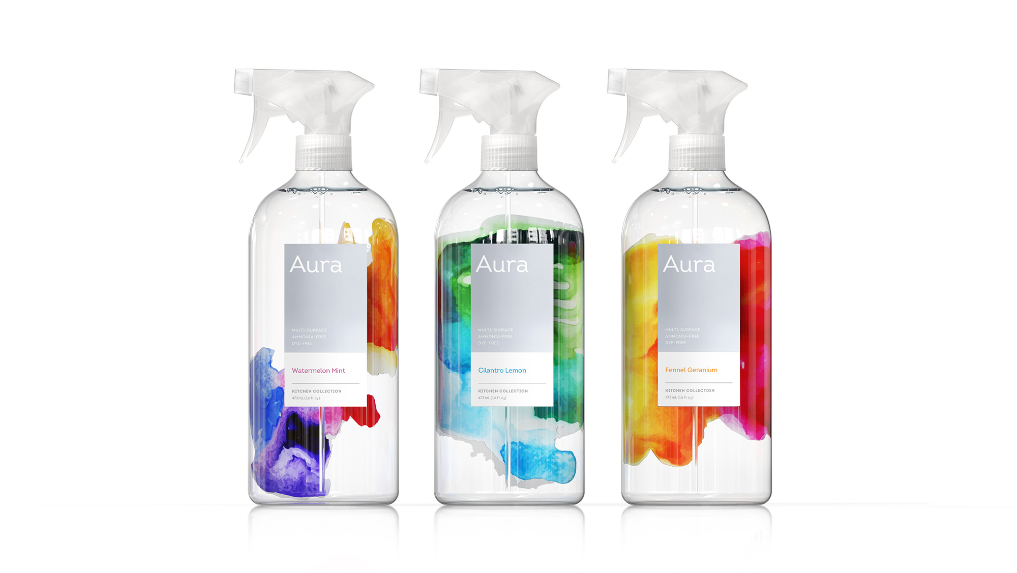
Watercolor Splash
Our first concept plays off the spiritual side of the Aura name, using bright watercolors to create a bold, free-flowing “essence” for the brand. From the vivid, organic patterns to the clean, modern typography and metallic label detail, this option is both trendy and refined, delivering a strong shelf presence and unique style for the household cleaner market.
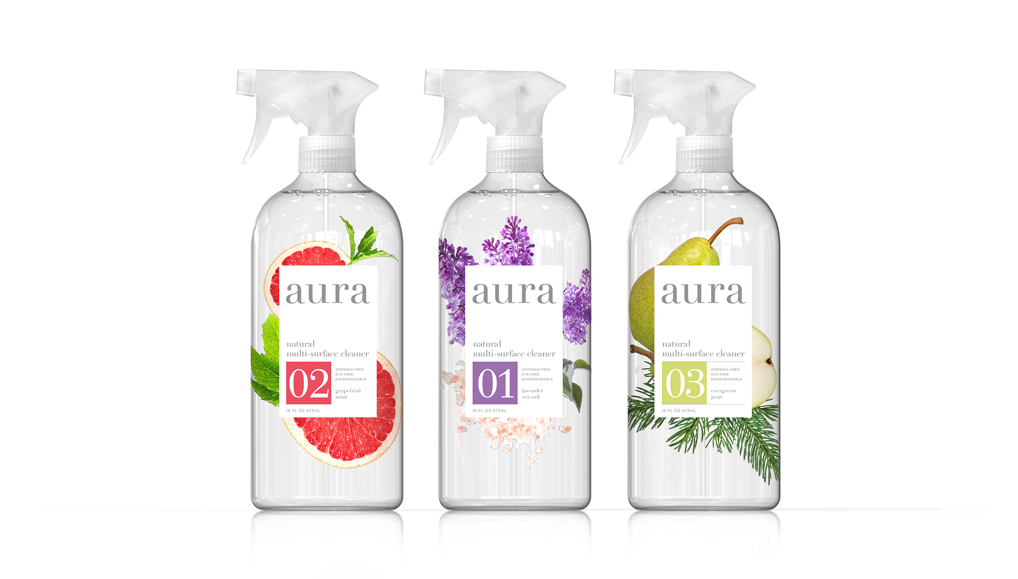
Modern Photorealism
Our second concept puts Aura’s scent combinations, a key purchase driver in the category, front and center, combining photography with sophisticated type styling to create a beautiful, refreshing look and feel for the brand. The numbering system for the different fragrances pays homage to luxury brands while the photorealistic ingredients feel fresh and natural.
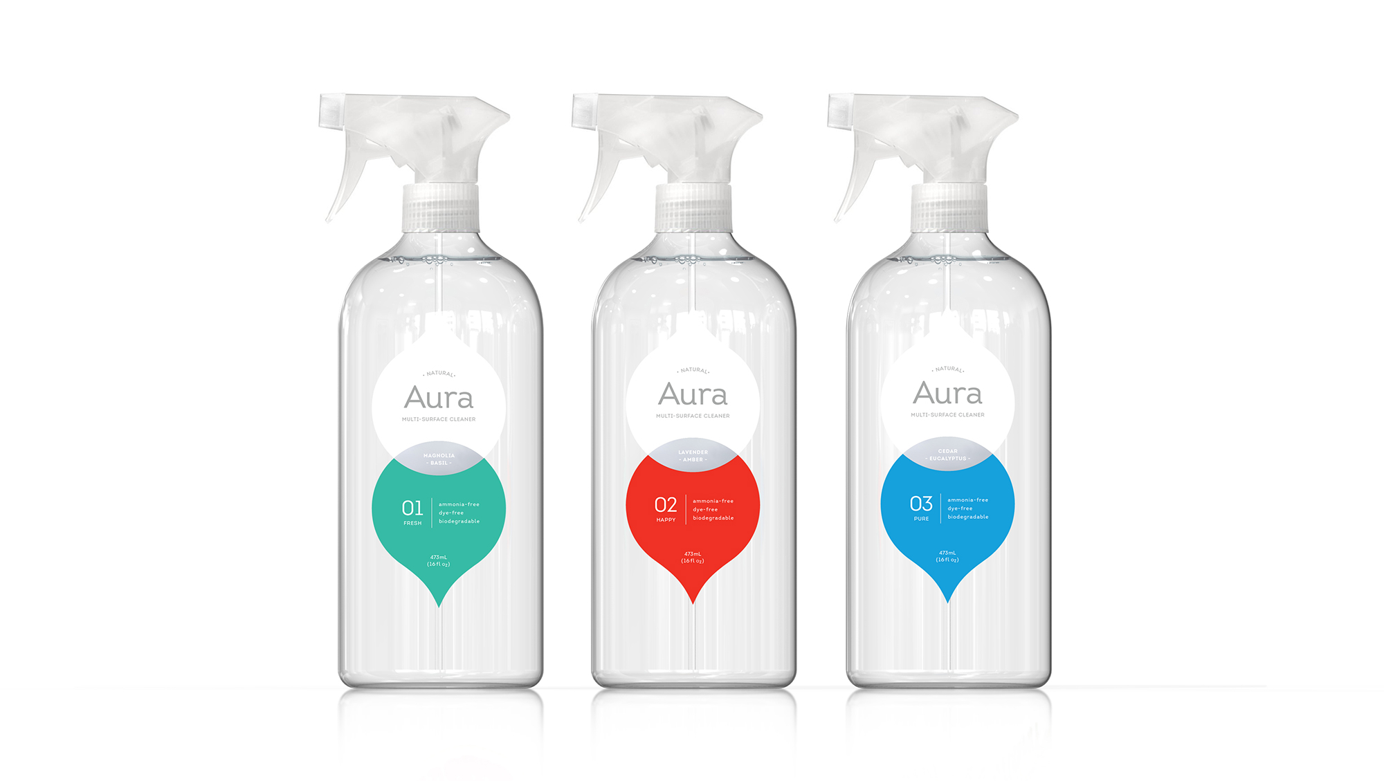
Minimalist Chic
Last, a clean, modern approach for a modern household cleaner. Nothing says expensive like a well-designed minimalist package, and this option delivers with a clean, light design and subtle metallic details. The concept also uses the numbering system, but pairs it with emotion-driven naming for the product scents – a common convention in fragrance, but new for the household cleaner market.